Our Top 10 Kitchen Cabinet Colors for 2024
September 23, 2024
A new coat of paint on your kitchen cabinets is a great way to refresh your space. But with so many colors to choose from, it can quickly feel overwhelming. Do you go for a neutral white, a vibrant green, or a moody blue? We get a lot of questions about what color to paint kitchen cabinets, so we decided to round up a list of our top 10 kitchen cabinet colors to give you some ideas.
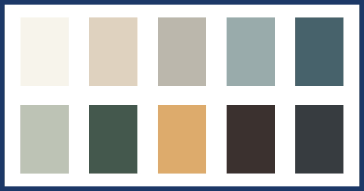
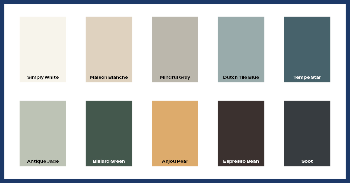
Our Top 10 Kitchen Cabinet Colors
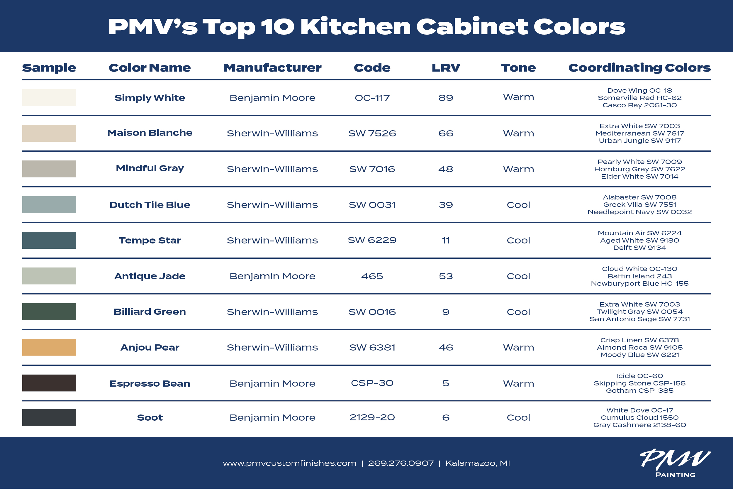
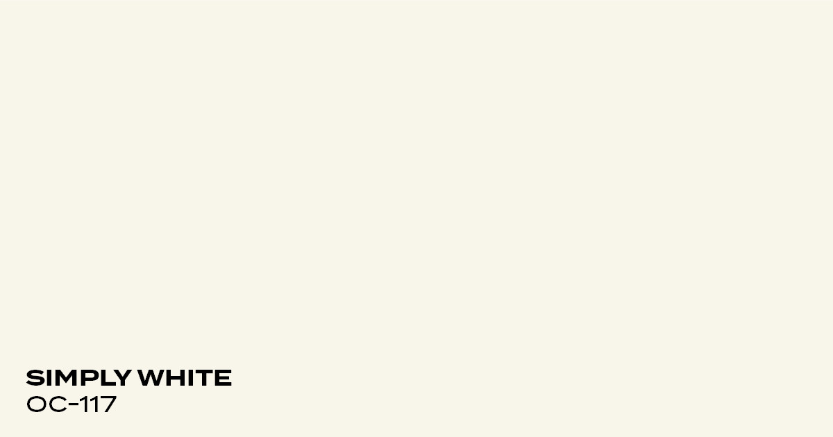
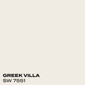
Simply White by Benjamin Moore
Simply white is a bright, warm white that’s great for almost any room in the house. In the kitchen, it lends warmth without making the space feel cold or sterile. Simply white has yellow undertones and can look off-white or cream in some lights. It pairs nicely with warm greige colors or bolder reds.
Color Code:OC-117
Coordinating Colors:
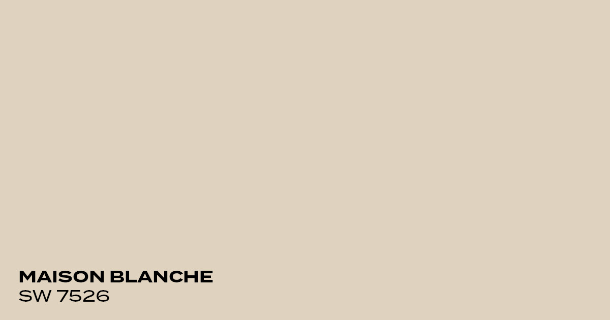
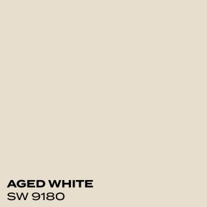
Maison Blanche by Sherwin-Williams
Maison Blanche is a neutral color that leans toward khaki. It has more depth than a stark white but doesn’t have the intensity of a darker beige or tan. Maison Blanche gives kitchen cabinets a nice warmth, which is perfect for a space where you spend time cooking or gathering with loved ones.
Color Code: SW 7526
Coordinating Colors:

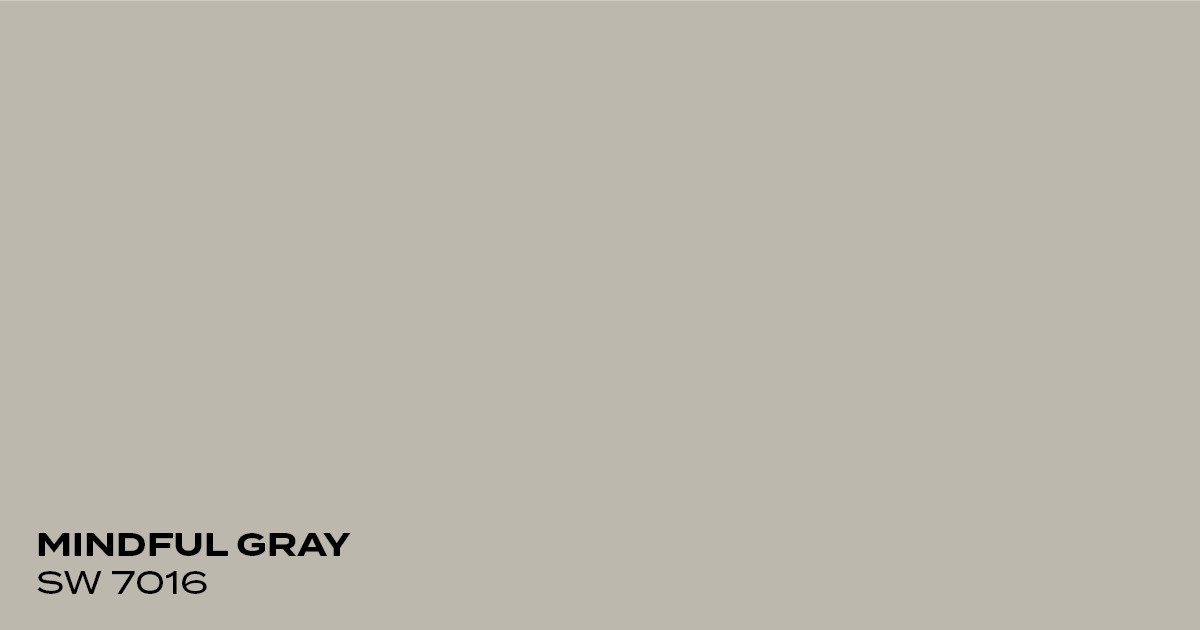
Mindful Gray by Sherwin-Williams
Mindful Gray is a warm gray that works great in kitchens with lots of natural light. It has barely perceptible green and blue tones, which help it pair well with other colors. With a bright white, this gray lends the space a more modern look. A creamy white works to bring out the warmth in this gray for a more cozy, traditional look.
Color Code: SW 7016
Coordinating Colors:
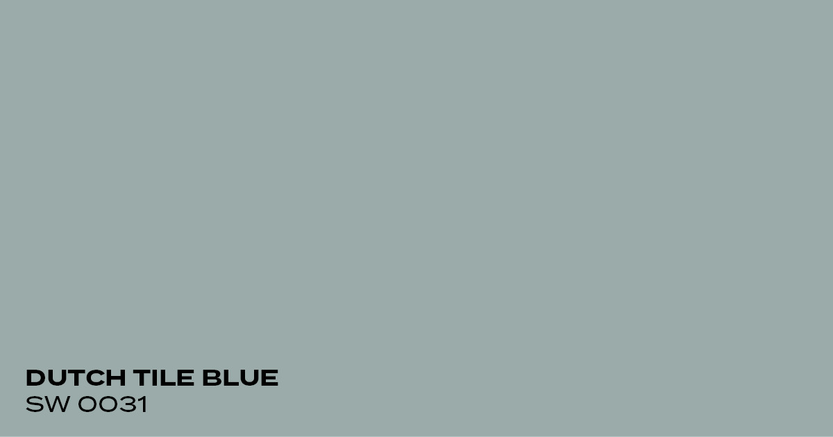
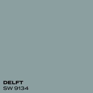
Dutch Tile Blue by Sherwin-Williams
Dutch Tile Blue is a soothing blue-ish gray color. It’s blue enough to add a nice amount of color without feeling overwhelming. Dutch Tile Blue is perfect for pairing with neutrals or adding accent colors in red.
Color Code: SW 0031
Coordinating Colors:


Tempe Star by Sherwin-Williams
Tempe Star is a dark blue that has a touch of calm sophistication and elegance. The slate-gray undertone gives the color a hint of drama and mystique. Tempe Star works well in kitchens with white or off-white walls. Brushed brass knobs and pull handles give the Tempe Star cabinets a luxurious look.
Color Code: SW 6229
Coordinating Colors:

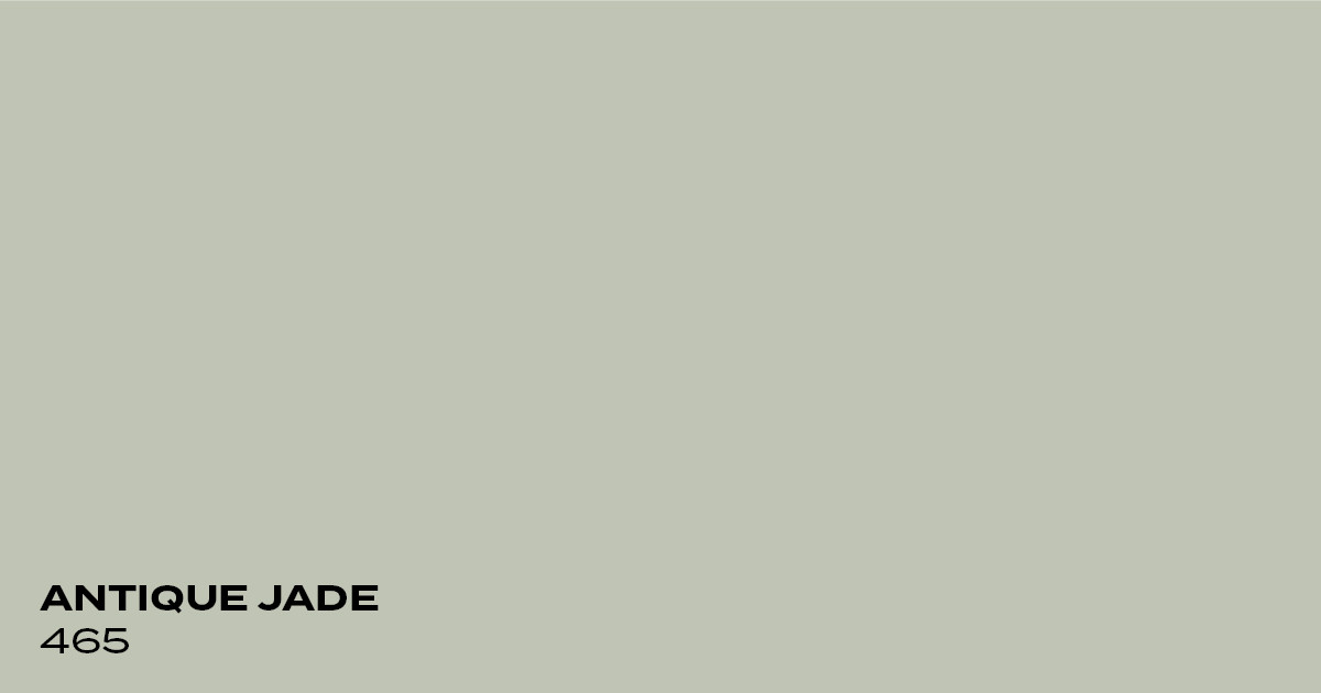
Antique Jade by Benjamin Moore
Antique Jade is a gentle green that skews a bit toward blue. In a kitchen, this color can bring a sense of relief and calm. This green can be a bit of a chameleon and look gray, gray-green, and green-blue, depending on the time of day and how much natural light the space has.
Color Code: 465
Coordinating Colors:

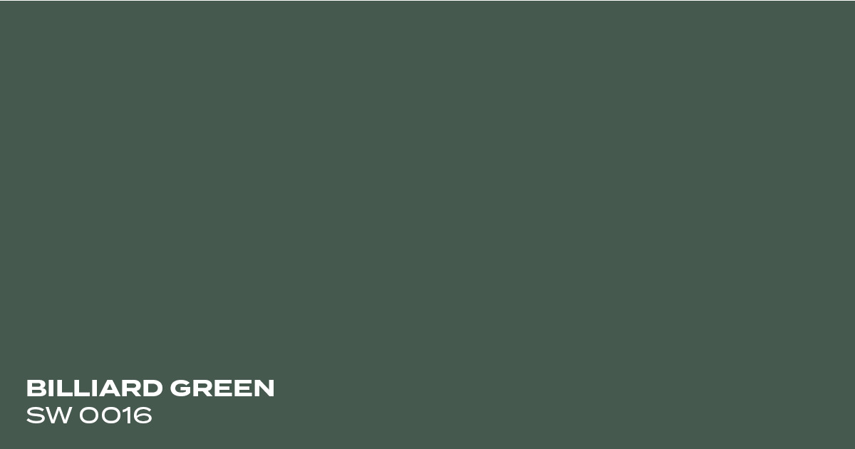
Billiard Green by Sherwin-Williams
Billiard Green is a classic and timeless shade that’s part of the Sherwin-Williams Historical Collection. It’s a cool-toned green with a modern and sophisticated feel. It pairs well with warm wood tones, tans, and blacks.
Color Code: SW 0016
Coordinating Colors:

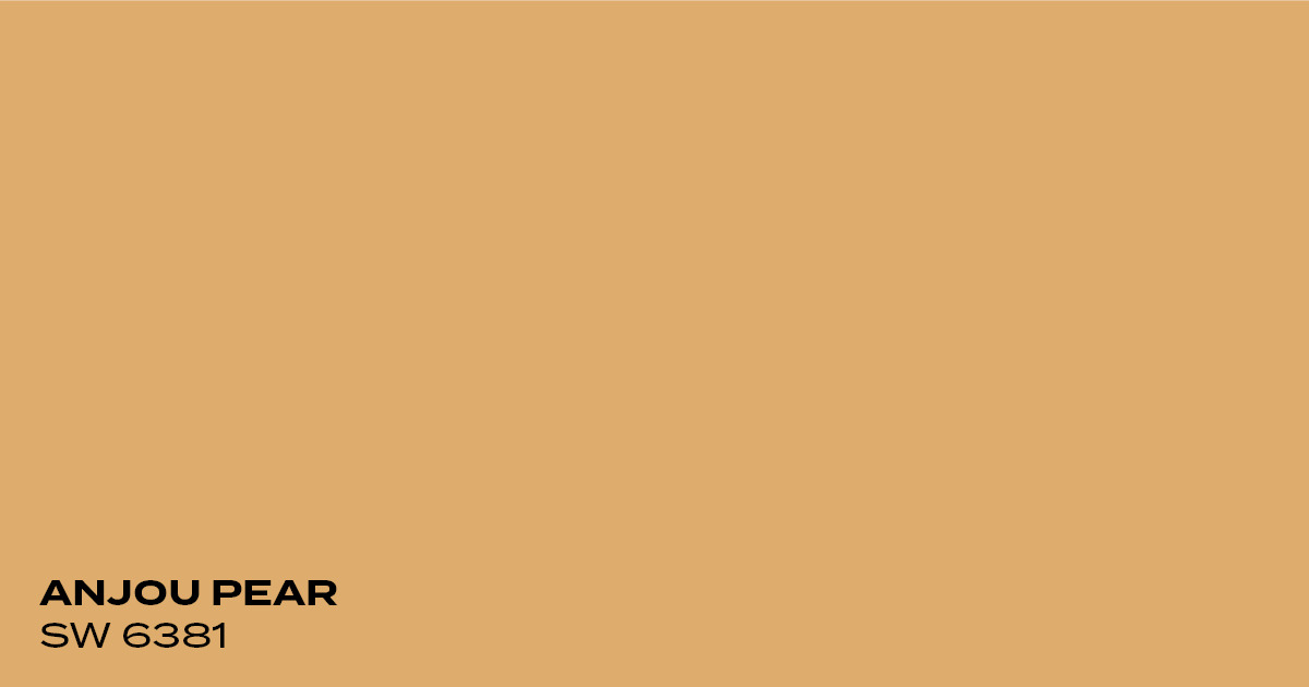
Anjou Pear by Sherwin-Williams
Anjou Pear is a warm yellow-orange that will almost instantly make you feel happy. It’s a great option for smaller kitchens because it can make the space feel bigger and brighter. It pairs well with warm off-white walls and looks wonderful with blue accents.
Color Code: SW 6381
Coordinating Colors:

Espresso Bean by Benjamin Moore
Espresso Bean is a bold, dark brown that has a nice energy to it. If your kitchen has a lot of natural light, a dark brown cabinet color can feel luxurious and sophisticated. A brighter white on the walls will contrast nicely with Espresso Bean, while a warm off-white will make it feel more cozy.
Color Code: CSP-30
Coordinating Colors:

Soot by Benjamin Moore
Soot is a clean and refined shade of charcoal. It’s one of the bolder choices on this list but one that will pay off with the right wall color. A clean, crisp white on the walls will contrast nicely with Soot and make your kitchen the focal point of your home.
Color Code: 2129-20
Coordinating Colors:


Three Easy Ways To Elevate Your Kitchen Cabinet Design
A new color for your kitchen cabinets is a great way to refresh your home, but there are additional ways to add interest and bring the various elements of your kitchen together. Here are three easy things you can do to take your kitchen cabinets to the next level.
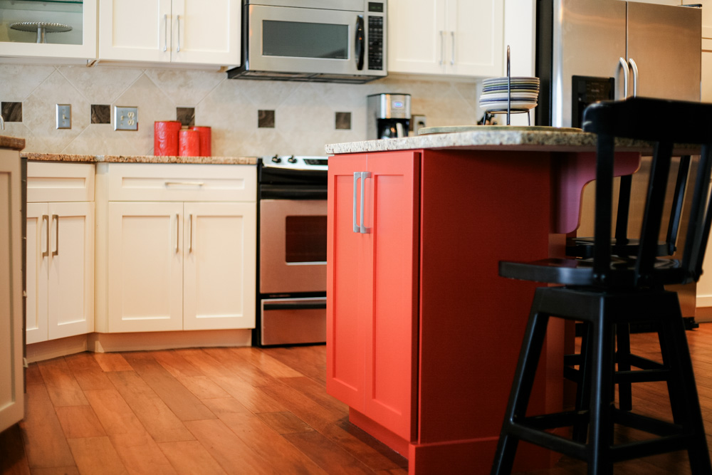
1. Create Contrast with an Accent Cabinet
Not every cabinet needs to be the same color. Create some dramatic contrast with a bold accent color on a kitchen island. One of our clients did this with a bold red and then tied everything together with other red accent pieces.
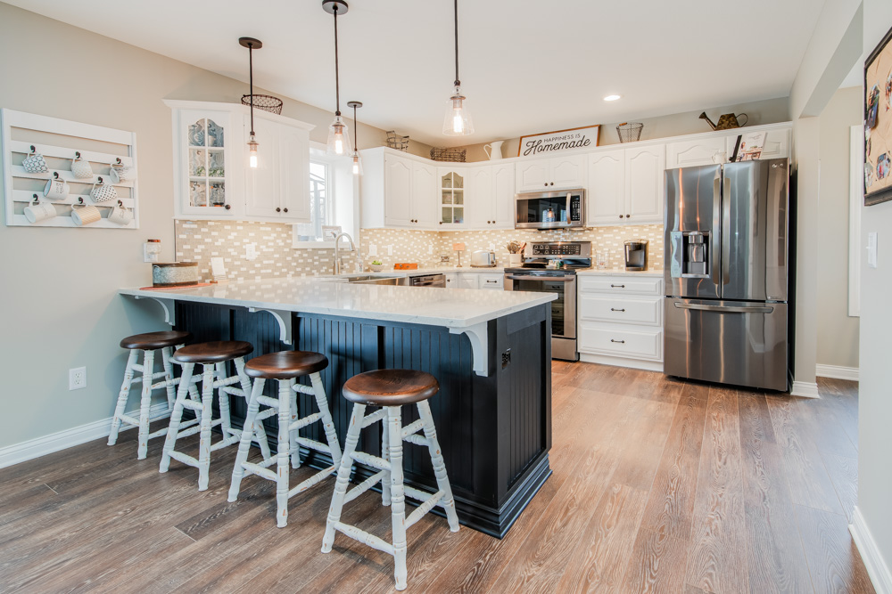
2. Add Depth with Architectural Details
Thoughtful details add depth and texture to your kitchen. Add wainscoting or paneling to a kitchen bar, try decorative counter brackets, or add glass doors in a few cabinets.
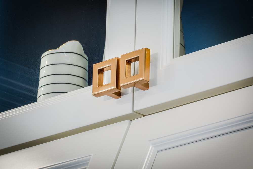
3. Add Interest With New Hardware
Knobs and pull bars aren’t just important for functional reasons. Cabinet hardware is the finishing touch that can instantly elevate a “plain white” cabinet into something modern and trendy.
Work With PMV To Create Your Dream Kitchen
Repainting your cabinets can feel stressful and overwhelming, but it doesn’t have to be. At PMV, we offer all of our clients the option to meet with a professional interior designer to talk about your ideas and find the perfect color that matches your aesthetic and lifestyle. Once you have your color, PMV’s expert painters take care of everything else and transform your kitchen into one you’ve always dreamed of. You can get started by scheduling a free painting estimate or contacting our office with any questions at 269.276.0907.
Posted in Kitchens, Residential Interior