Top 10 White and Off-White Paint Colors for 2024
July 26, 2024
White and off-white are timeless paint colors that offer endless character and versatility. Crisp white walls can be the perfect backdrop for colorful kitchen cabinets or create a foundation for a cozy farmhouse-inspired design. Here’s our list of the top ten white and off-white paint colors for your home’s interior.
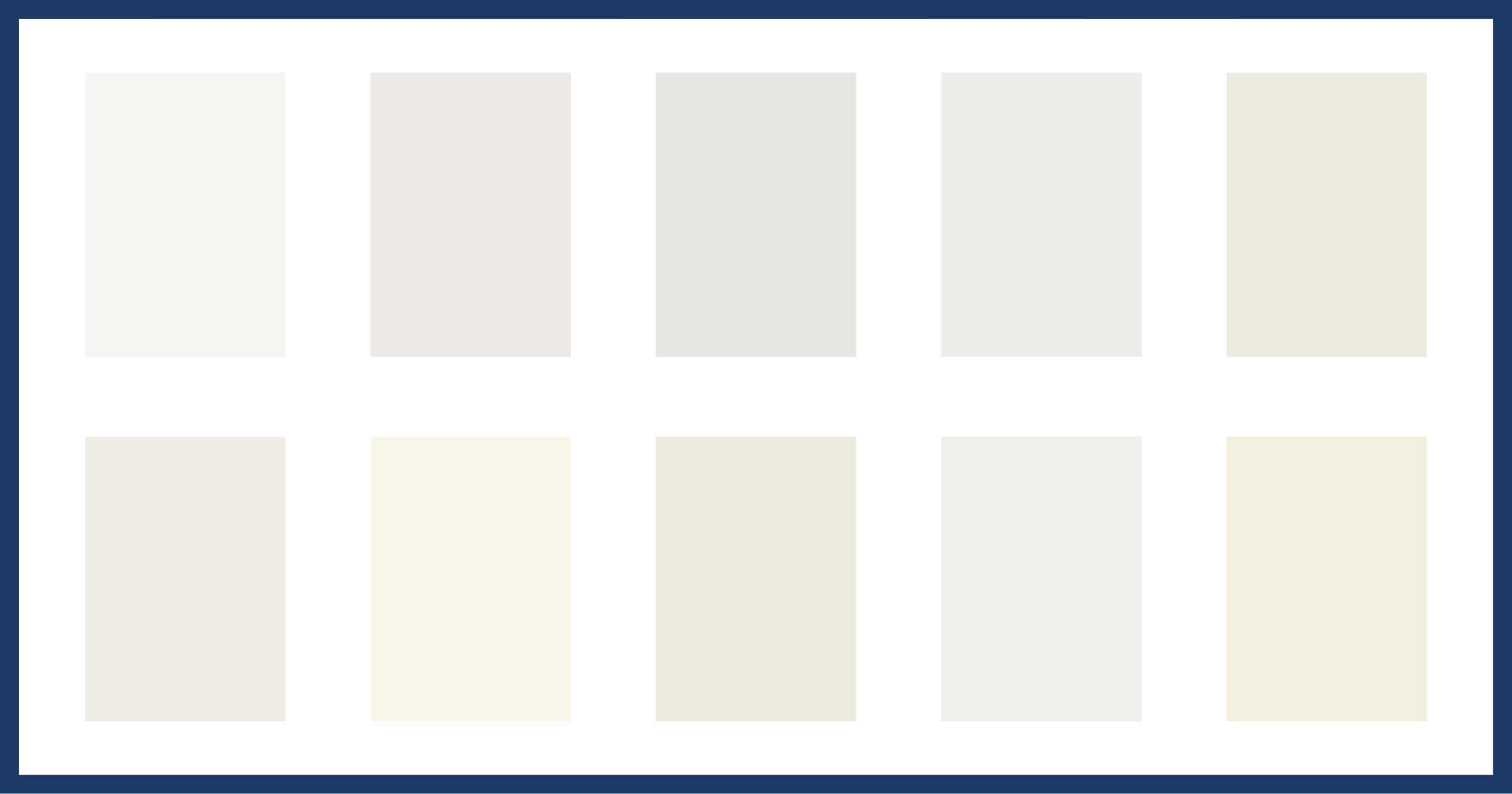
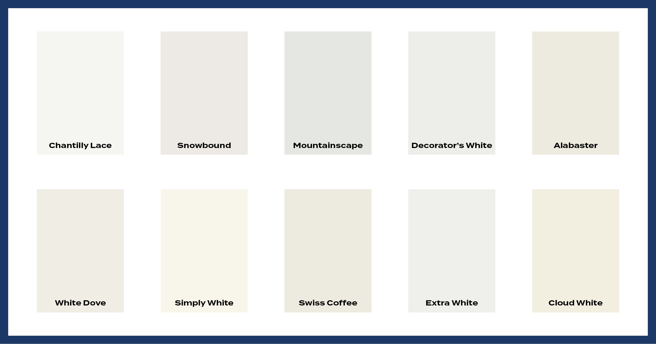
Our Top 10 White and Off-White Paint Colors

Chantilly Lace by Benjamin Moore
Chantilly Lace reads clean, crisp and simple. It is a consistent favorite among decorators because of its versatility and beauty. This is Benjamin Moore’s truest white with very slight gray and blue undertones. This has become a fast growing popular color choice for a pure, bright white. This shade of white can work for trims, doors, ceilings and on occasion the walls as well and is great for achieving a streamlined, modern look.
Color Code:OC-65
Coordinating Colors:

Snowbound by Sherwin-Williams
Snowbound is an off-white that has a cooler undertone if you are comparing it to a color like Sherwin William’s “Alabaster”. It is great if you are looking for a soft clean look that is not bright white. Snowbound has a slight gray/greige undertone. It is a cooler white that is crisp and clean. It creates the perfect canvas for adding texture and creating a modern farmhouse or cottage feel.
Color Code: SW 7004
Coordinating Colors:

Mountainscape by Benjamin Moore
This color has a very slight mixture of cool and warm undertones. It is a great wall color to accent brighter white trim which will give your home dimension. This is also a beautiful color for an “accent” room to break up a monochromatic home and add a warm and traditional feel.
Color Code: 870 (OC-64)
Coordinating Colors:


Decorator’s White by Benjamin Moore
Decorator’s White has a cool undertone and contains a little gray, creating an off-white option that doesn’t lean in any particular color tone, but it’s a softer version of a pure white such as Chantilly Lace. This particular shade of white is a good option for trim colors when combined with grays. Decorator’s White is a fairly pure white but the touch or gray undertone softens it and makes it a perfect choice for cabinets and trim. Decorator’s White can also be a great choice for a wall paint color if you want a fairly pure white that’s not too stark.
Color Code: OC-149
Coordinating Colors:


Alabaster by Sherwin-Williams
Alabaster can help create that calm in a modern and stylish finish. Being a light neutral, Alabaster is versatile and useful for any room. This color works well with generally warm colors as they accent it’s warm undertones. It has been a very popular “farmhouse” color recently. This is one white that looks just as good on walls as it does on trim. This white has a bit more colorant in it, making it look a bit softer on a larger scale. This color will not behave as a pure white as it has more warm undertones. It has a neutral base so it isn’t overly creamy.
Color Code: SW 7008
Coordinating Colors:

White Dove by Benjamin Moore
White Dove is a completely versatile color, suitable for trim, kitchen cabinets as well as walls. White Dove can also be used as both the wall and trim colors at the same time, with preferably different sheen textures, to make a room appear taller. It’s not too sterile and has virtually no yellow undertones making it perfect for a bright, modern look. White Dove complements a wide range of colors. The shade has a touch of gray that keep it from feeling stark. It also maintains enough warmth so that it is not too cool, yet it does not go too creamy or yellow.
Color Code: OC-17
Coordinating Colors:


Simply White by Benjamin Moore
Simply White is a great basic white for anywhere in your home. When painted on walls it does not make the room feel cold or sterile but instead makes it feel inviting and cozy. This color is great if your are looking for a modern but also lived in feel. Simply white is both bright yet warm. It pairs very nicely with warm greige colors as well as light gray colors.
Color Code: OC-117
Coordinating Colors:
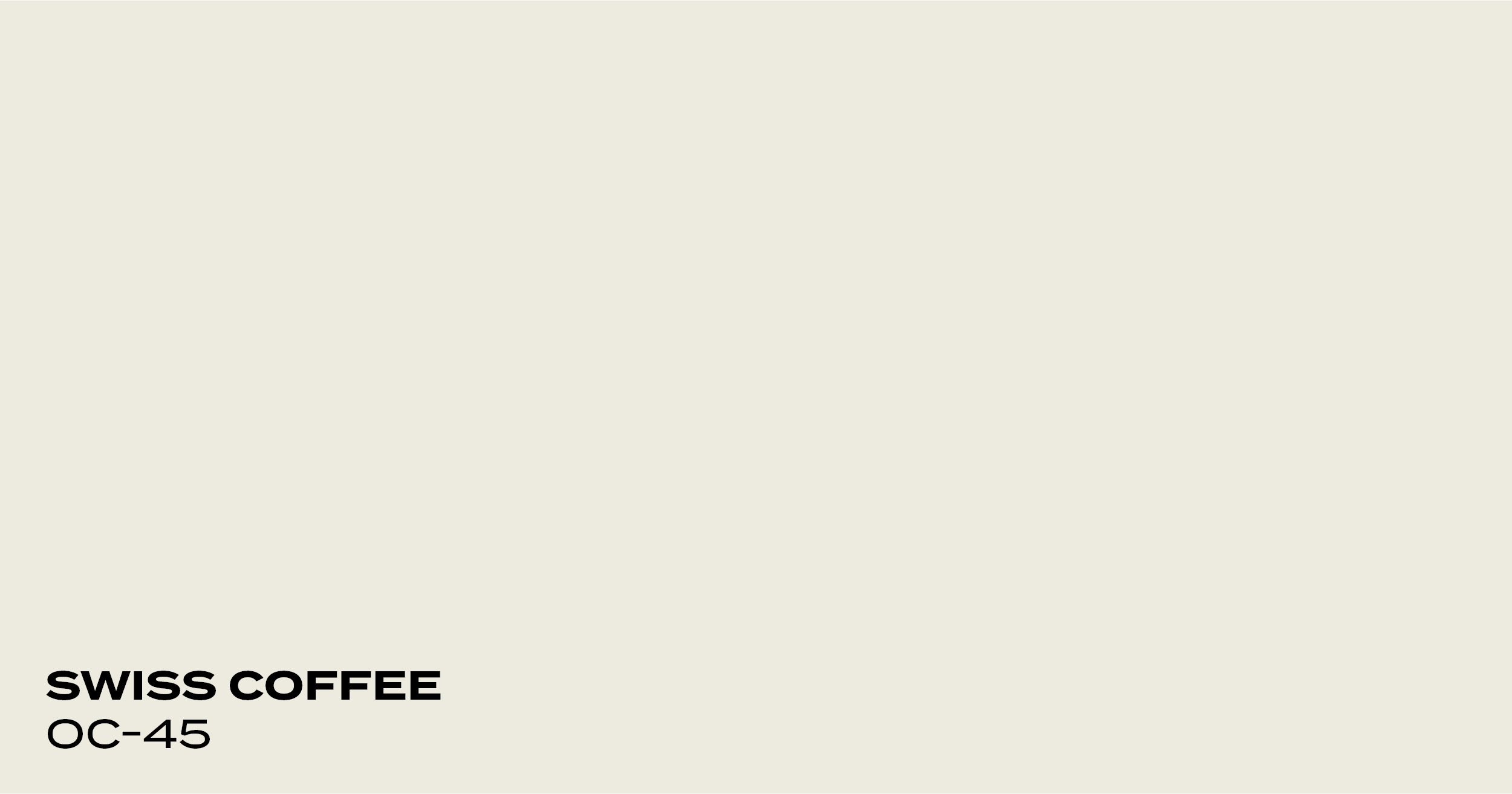
Swiss Coffee by Benjamin Moore
If you are looking for a creamy, warmer white, this color will be great. The off-white tint of this color lends a welcoming softness and elegance to a space. Swiss Coffee does not reflect natural light as brightly as a true, crisp white would, which adds some much-needed warmth to a space with bright white trim and ceilings. This color has soft yellow/gold undertones in some lighting.
Color Code: OC-45
Coordinating Colors:
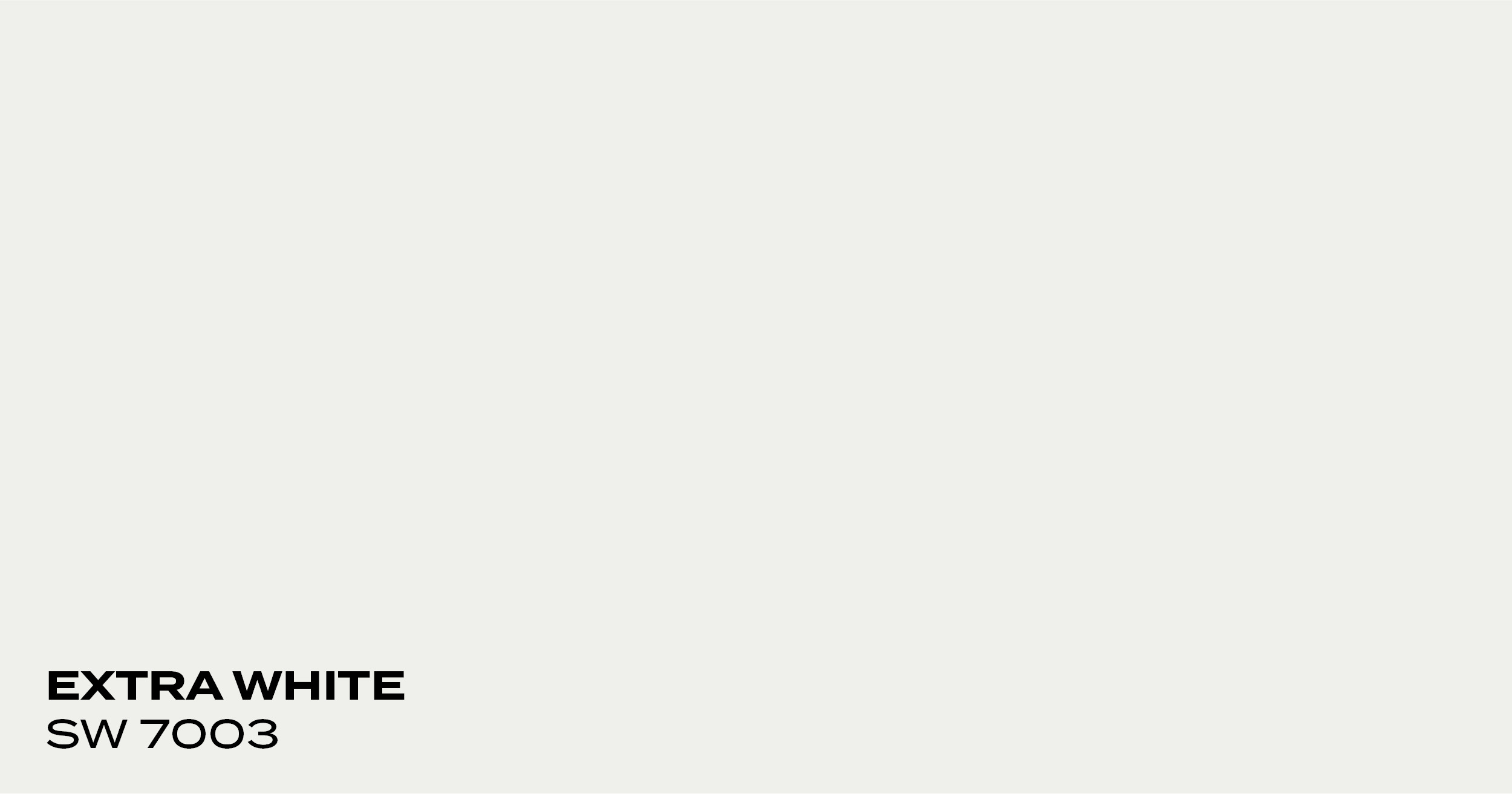
Extra White by Sherwin-Williams
Extra White is a crisp, clean white, and has slightly cool undertones and no creamy undertones. This white is perfect for walls and especially great for trim, ceilings, and doors. This white is bright which makes it an ideal color for cabinets. Extra White does not have any warm or yellow undertones which ensures it will look bright white in most lighting without the risk of looking dingy. This white would not pair very well with warm-toned colors as it’s pretty stark, crisp, and clean.
Color Code: SW 7003
Coordinating Colors:
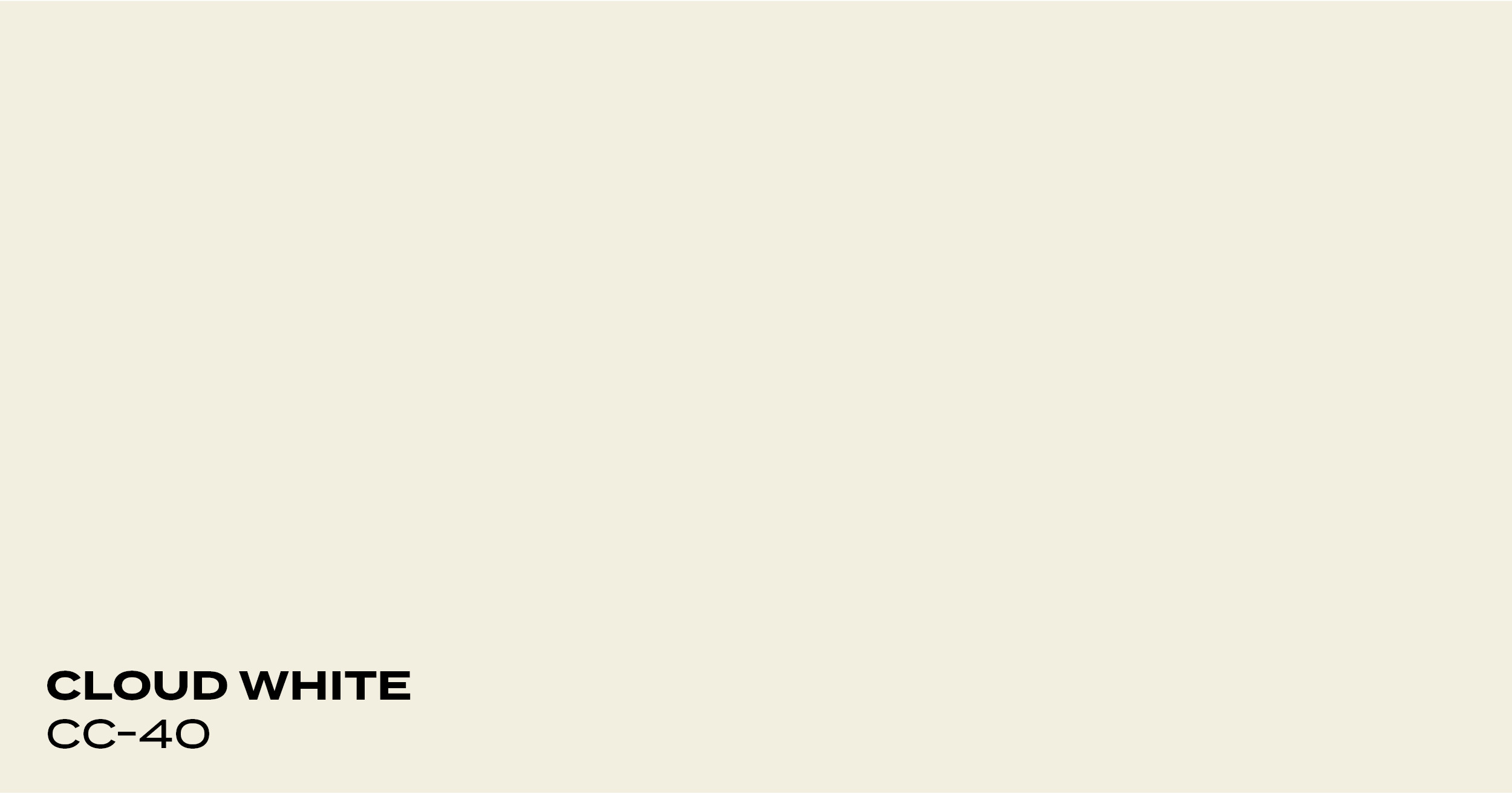
Cloud White by Benjamin Moore
Cloud White has a warm yellow undertone and works really well with richer, warmer earth tones. Although it’s not quite off-white, Cloud White is not as bright and reflective as some other whites and the added warmth makes the space feel comfortable and inviting.
Color Code: CC-40
Coordinating Colors:

A Quick Note About Undertones and Light Reflectance Value (LRV)
Every paint color has a mass tone and an undertone. A mass tone is easy to identify because it’s the overall color of the paint itself. Undertones are trickier to identify because they are the secondary colors giving the main color its particular flavor. Undertones can be warm (red, orange, and yellow) or cool (green, blue, purple).
Undertones are important because they affect how your color looks in natural light and how it looks next to other colors. A cool-toned white can look chilly in a room with low natural light. A warm white can suddenly start looking yellow if it’s next to a painting with yellow flowers. Even worse, mismatching cool and warmed-tone colors can create a visual dissonance in your space, almost like the colors are singing off-key.
Light Reflectance Value measures how light or dark a paint color is on a scale of 0-100. A 0 on the scale is pure black and a 100 is pure white. You can think of this scale as measuring a color’s depth. Instead of saying light, medium, or dark, you now have a reference for just how light or how dark a color really is. Off-white colors typically have LRVs in the 73-81 range and whites are in the 82-94 range. This is important when you’re picking multiple colors because white paint doesn’t just reflect light, but reflects the colors in that light. A white like Chantilly Lace with a 90 LRV will reflect more blue light than Mountainscape, which has a 78 LVR. Both will pick up blue tones, but Chantilly lace will pick up more.
Knowing the basics about undertones and LRV can help you choose a white or off-white that harmonizes with the rest of your home. If you want to paint your kitchen walls white and your cabinets blue, you know to look for a white with a cool undertone. Depending on the size of your kitchen, you can decide how much light you want the walls to reflect. If you’re unsure about what white or off-white to choose, it might be worth it to talk to a color consultant. Working with a professional can save you the stress of picking a color on your own and find something that you’ll love for many years to come.
Your Dream Home Awaits With PMV Custom Finishes
Choosing the perfect white or off-white for your home isn’t always easy. Working with an expert like PMV can help you navigate the stress of painting and create the home you’ve always dreamed of having. We work with an experienced interior designer to offer our clients color consultations at no extra cost. You can get started by scheduling a free painting estimate or contacting our office with any questions at 269.276.0907.
Posted in Kitchens, Residential Interior