Top 10 Gray Paint Colors We're Loving in 2024
July 8, 2024
Gone are the days of gloomy grays! Modern gray paint colors are a great way to add depth and character to your home. Want to add some dramatic contrast with an accent wall or create a cozy, relaxed vibe? The right gray can get you there! Here’s our list of the top 10 gray paint colors for your home’s interior.
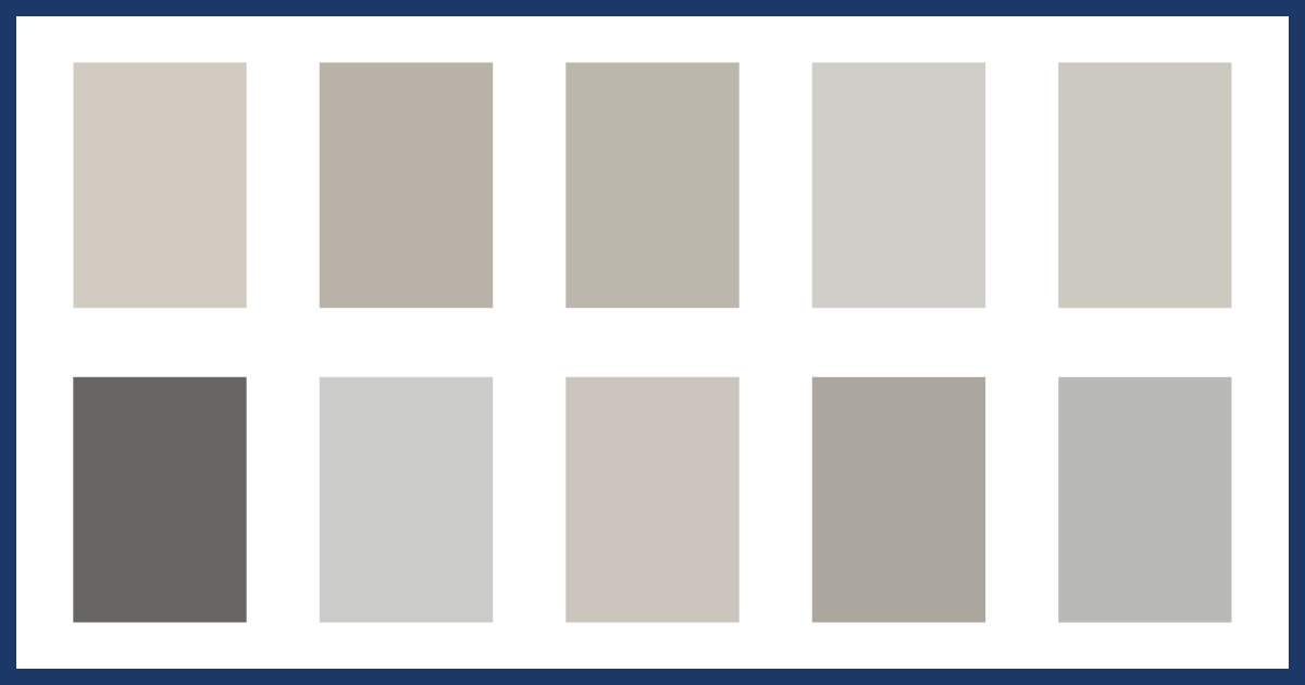
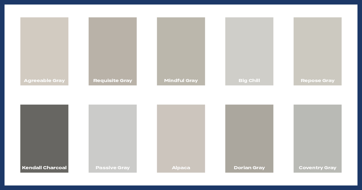
Our Top 10 Gray Paint Colors
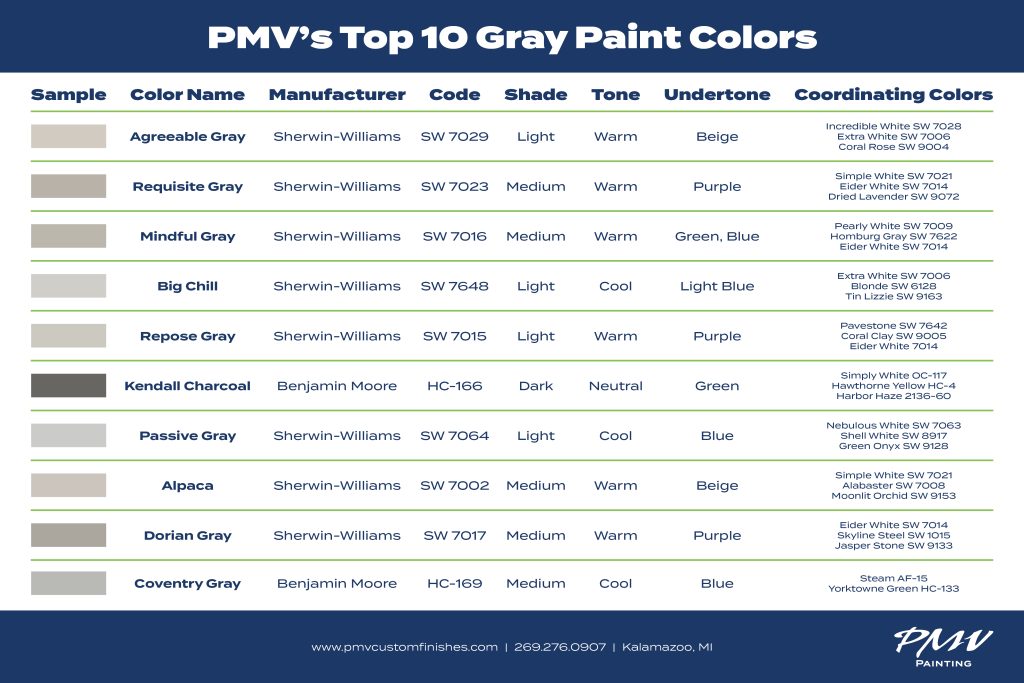
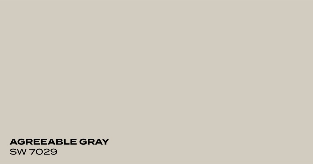
Agreeable Gray by Sherwin-Williams
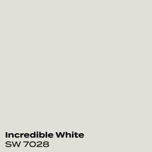
Agreeable Gray is a light gray paint color with some warmer beige undertones. It also has a very slight purple undertone which adds depth to it. This color works best with a bright white that has no yellow undertones. The greige in Agreeable Gray will bring out the yellow in the white and it will not look as clean and crisp.
Color Code: SW 7029
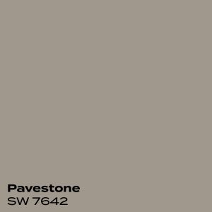
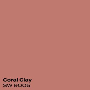
Coordinating Colors:

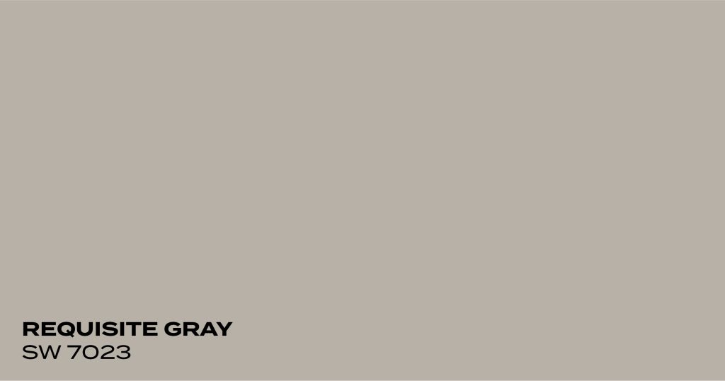
Requisite Gray by Sherwin-Williams
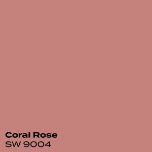
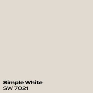
Requisite Gray is a light to medium-toned color. It has enough pigment to keep it from getting washed out in a room with lots of natural light. It has a mix of subtle purple and warm undertones. This color gives you a ton of options for a coordinating white. If you want to bring out its warm undertones, then a warm white would be perfect. If you want to bring out the cool tones more then a bright white is the way to go.
Color Code: SW 7023
Coordinating Colors:

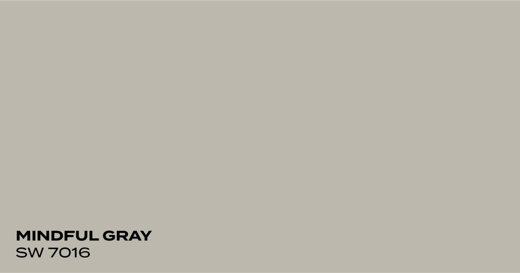
Mindful Gray by Sherwin-Williams
Mindful Gray is a warm gray with barely perceptible green and blue tones, making it a great neutral color. It is a bit of a darker version of Repose Gray, which makes it very versatile when paired with white. A bright white would stand out and give the space a great modern look. A creamy white would bring out the warmth in this gray and create a cozy, more traditional look.
Color Code: SW 7016
Coordinating Colors:


Big Chill by Sherwin-Williams
Big Chill is a light and bright gray with very subtle light blue undertones. It is a cooler gray but still gives the right amount of depth to a room because it is not too icy. Because of its very soft, light blue undertones, this color will work best with a crisp, clean white.
Color Code: SW 7648
Coordinating Colors:
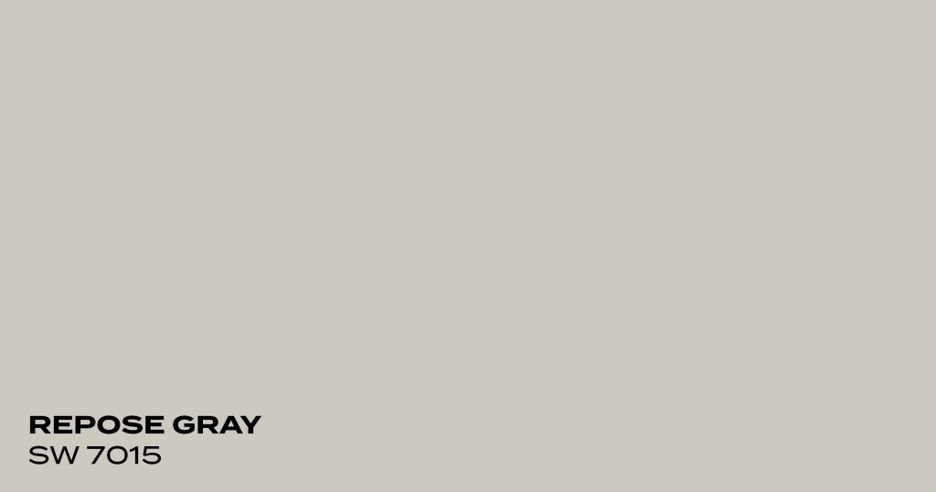
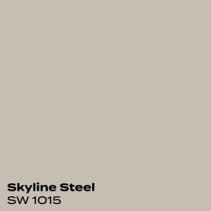
Repose Gray by Sherwin-Williams
Repose Gray is a gray with greige and faint purple undertones. This color won’t brighten up a very dark room; however, when it is painted in a light room, its warmer undertones add depth. Pairing this color with a white is very flexible. A white with some slight creamy undertones will make the space feel a bit warmer, while a brighter white will give it a more modern feel.
Color Code: SW 7015
Coordinating Colors:

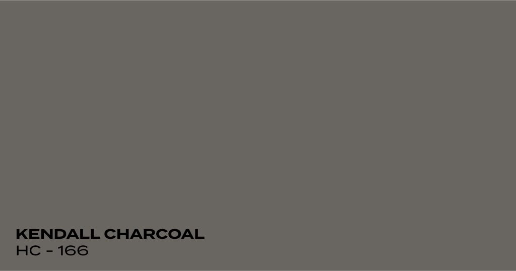
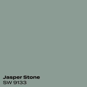
Kendall Charcoal by Benjamin Moore
Kendall Charcoal is a deep and luxurious gray paint color. It is great for a feature wall or accenting wainscotting. Its undertones are complex but it usually leans green. For south-facing rooms, Kendall Charcoal will look warmer without straying into greige territory. In north-facing rooms, this color will look solidly gray with almost no warm tones. It works well to accent bright white but also soft creamy whites.
Color Code: HC-166
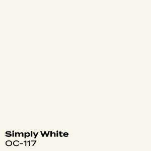
Coordinating Colors:
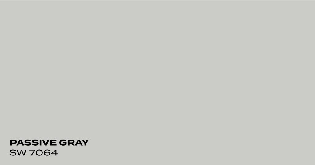
Passive Gray by Sherwin-Williams
Passive Gray is a light gray paint color. Its undertones tend to lean blue or purple, but it will not look purple on your wall. Passive is a very flexible gray because you can’t really see its undertones. When looking to pair this color with a white paint color, it is best to choose a brighter, crisp white as opposed to a creamy white. The bright white will bring out the depth of this color.
Color Code: SW 7064
Coordinating Colors:
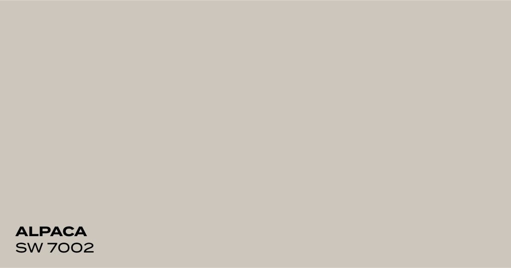
Alpaca by Sherwin-Williams
Alpaca is a greige color with some warm brown undertones but also a hint of purple that makes it a bit cooler. Alpaca works great in rooms with softer lighting so that it can bring out its greige undertones rather than the purple ones. Alpaca would look great with a white that has very slight creamy undertones because it will warm up the space and make it feel cozy. A bright white trim color could bring out the purple undertones a bit more.
Color Code: SW 7002
Coordinating Colors:
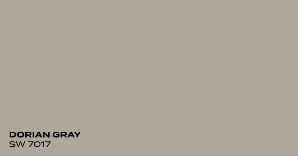
Dorian Gray by Sherwin-Williams
Dorian Gray is a medium-toned color with a slightly greige undertone. This color will add warmth and depth to a room that has a good amount of natural light; in a dark room, it will make the room look even darker. This color pairs very well with a bright white and also looks great with darker hardwood floors.
Color Code: SW 7017
Coordinating Colors:
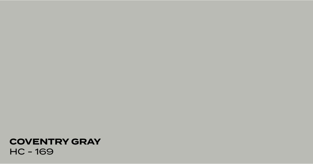
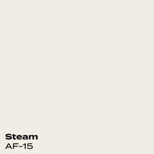
Coventry Gray by Benjamin Moore
Coventry Gray has a light to medium-toned with a bit more body than other lighter grays. Its soft blue undertone lends it a cool feeling without feeling icy. Keep in mind that this gray will look cooler in a north-facing room and softer in a south-facing room.
Color Code: HC-169
Coordinating Colors:
Create Your Dream Home With PMV Custom Finishes
Choosing the perfect gray for your home isn’t always easy. How do you know if a warm tone or cool tone will look better with your countertops or flooring? What if a gray with purple undertones looks purple once it’s on the wall? Working with an expert like PMV can help you navigate these concerns and create your dream home. We work with an experienced interior designer to offer our clients color consultations at no extra cost. That way you can make color choices you feel great about and that will enhance your home’s visual appeal.
You can get started by scheduling a free painting estimate or contacting our office with any questions at 269.276.0907.
Posted in Uncategorized